System Settings — Part 6
Appearance Page
Welcome back!
Last time we completed the analysis of the General Page of System Settings. Today, we delve deep into the Appearance Page.
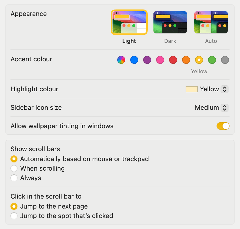
When you first access it, here is what it looks like:

It is divided into two main sections, one dedicated exclusively to the aesthetic outlook of macOS, and another governing how scroll bars should work.
Aesthetic Decisions
General Appearance
Assuming you have not already made your choice during the setup process, or if you want to change it, the first option presented to you is on whether you would like to have a Light, Dark, or Automatic appearance. Dark Mode was introduced back in macOS 10.14 Mojave, well over 7 years ago. My choice is always Light, since white text on a dark background has the tendency of tiring my eyes too much. It is a truly personal choice, and you should pick what makes you feel better. The Auto option follows the dawn and sunset times of your zone and switches from Light to Dark following the sun. It is a nice option, and something I have used on my mobile devices for a while.
Accent & Highlight colour
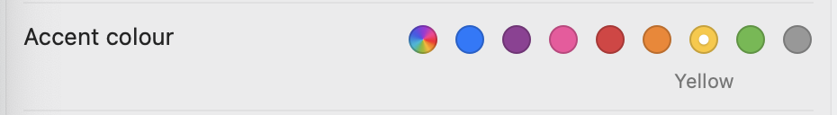
Accent colour determines the colour to use for buttons, pop-up menus and other UI controls. The first option, looking like a kaleidoscope, allows the accent colour to adapt to the application that is in focus—assuming that the developer has implemented this. The default for a new installation of macOS, or of Safe mode boot, is blue, while my favourite is yellow.
I chose the same for the Highlight colour, which is used for highlighting selected text.
Miscellaneous
The Sidebar icon size dropdown menu, offering Small, Medium, and Large options, determines the size of the icons in the list of pages in the System Settings app. I kept it medium.
I have also turned on the Allow wallpaper tinting in windows setting, which allows colour from the wallpaper to—subtly—tint certain window areas, such as toolbars or status bars.
Scroll bars
Scroll bars appear in a window when there’s content that doesn’t fit into the window’s current size.
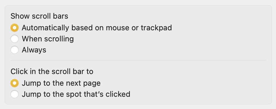
The top option determines when they should appear. I have been using trackpads (either the internal one of the MacBook Pro or the Magic Trackpad) for the last eight years and had forgotten how clumsy the Finder looks when using a mouse. If using a mouse, I suggest switching the top option to When scrolling.
The bottom option is useful for those who like to click in the scroll bar area. Personally, with a trackpad and its excellent inertia movement, I have never found the need to do that.
Bottom Line
Thank you for reading this short episode. In the next one, we will continue our exploration of System Settings with the Accessibility page. Stay tuned!
If you are interested in music notation and editorial design, please consider joining my mailing list here, I would deeply appreciate it.
I hope you found it useful. If you did, please leave a like, share it, subscribe to be notified of upcoming articles! Please share your experience setting up your Mac down in the comments, and have a great day!

One thought on “My upgrading path to Apple Silicon — Part 12”