
System Settings — Part 8
Welcome back!
Last time we carefully dipped our toes into the Accessibility Page of System Settings, looking at the first two pages of the Vision section: VoiceOver and Zoom. Today, we are completing this section with three new pages: Display, Spoken Content, and Descriptions.
Let’s get started.
Accessibility Page — Part 2
Vision — Part 2: Display, Spoken Content and Descriptions
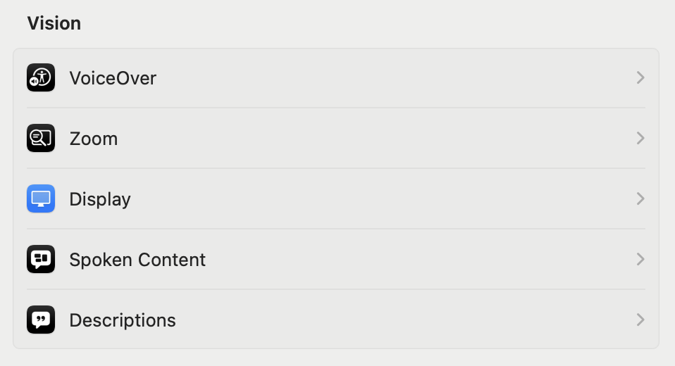
Display
This page is divided into four sections: a general one, then Text, Pointer, and Colour Filters.
BASICS
Starting from the top of the first section, we have the possibility to Invert colours, which, for example, shows white text on a black background. I have tried to capture a screenshot of the Help window with colours inverted but, upon looking at the resulting file, it shows unchanged colours. So, this is different from Dark Mode, and interface elements maintain their standard appearance even if they are shown differently. Just below, one can choose between inverting colours everywhere (Classic mode) or excluding images and videos (Smart mode, the default).
Reduce motion stops or reduces the movement of elements displayed onscreen, such as when one launches an app, or switches between different desktops. The next option, Dim flashing lights, automatically dims the display of content that depicts flashing or strobing lights. An important note can be found in the Help window:
This option is available only for supported media and on Mac computers with Apple Silicon. Content is processed on-device in real time. “Dim flashing lights” should not be relied upon for the treatment of any medical condition.
Increase contrast is something I use on all of my mobile devices but, for reasons unknown to me, the result on macOS is just horrible to look at.

Perhaps someone with real visual impairment could help me understand what is going on here. Reduce transparency replaces the transparent effect used on some macOS backgrounds with a solid background. This may improve contrast and readability but is something that I leave OFF. Differentiate without colour uses shapes to convey information about the interface elements, in addition to (or instead of) colour. In the System Settings app, this has the effect of adding little “|” and “o” inside the switches. Other effects are possible.
Auto-play animated images, ON by default, automatically plays back GIFs and other animations in Safari and Messages (and other apps that support this). Show window title icons, ON by default, shows a window’s icon (if available) in the window’s title bar. The icon can help distinguish windows or tabs when several are open—for example, Finder windows/tabs showing Recents, Downloads and iCloud Drive. Show toolbar button shapes, OFF by default, shows a subtle border around toolbar buttons to indicate the area where to click/tap:
Finally, the Display contrast slider, by default set to Normal, manages the screen’s contrast. There are six steps, but the slider moves fluently between them: for me, the first step is already too much, and interface elements disappear in a burst of light with anything beyond. I suggest keeping this OFF (that is, to the minimum), unless you know what you are doing.
TEXT
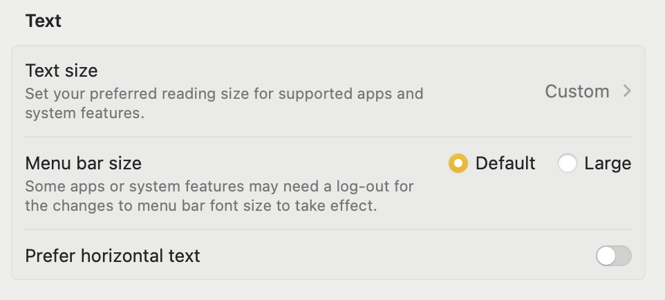
The Text section contains a table view with three rows for as many choices. The first one is Text size, which prompts the user to set their preferred reading size for supported apps and system features. Mine defaults to “Custom” and upon clicking on either that word or the chevron to its right, a modal dialogue appears:

I’m not sure why the smaller A to the left of the slider was highlighted in that way, since the relevant option was OFF. You can either drag the slider or click on either of the two ‘As’ at its extremities to see the text in the interface below the dialogue dynamically adapt to your choice. Below that, there are custom options for five macOS apps: Calendar, Finder, Mail, Messages, and Notes. I have left all of them apart from Mail set to “Use Preferred Reading Size”. Setting Mail text to 14 pt (that’s two points bigger) is what changes the text of the button from “Default” to “Custom”.
The next option is a simple radio button choice between “Default” and “Large” to decide the Menu bar size. I kept it to “Default”.
Finally, Prefer horizontal text should be turned ON if you would like to see the text displayed horizontally, even for languages that prefer vertical text.
POINTER

One of the funniest features of the pointer in macOS, introduced back in version 10.11 El Capitan, is that allowing you to quickly move the mouse or your finger(s) on the trackpad to temporarily enlarge the pointer.
Next, you can enlarge the Pointer size from the default, six notches up to Large. I believe I have never changed this setting in the almost 9 years since its introduction.
In a new table below, we are given the possibility to change the Pointer outline colour and the Pointer fill colour, with a handy button to Reset Colours to their defaults (white outline and black fill).
COLOUR FILTERS
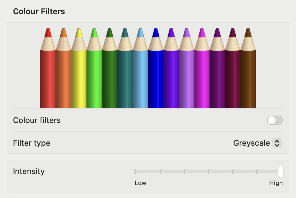
This last section is fundamental for all those users who have a specific colour vision deficiency. The pencils reflect how the filter affects a range of colours, and we can apply a filter to view the entire screen in greyscale, to adjust colours for a specific condition, or to tint the screen with a colour of our choosing. Please note that if Night Shift or Invert colours are turned on, no other filter aside greyscale will be available.
To get started, turn ON the Colour filters toggle. A big square message in the middle of the screen says, “Colour filters ON”, and it defaults to greyscale. The Intensity slider, at the bottom, defaults to the maximum value of High, and I encourage you to try the different steps. As someone who spends more than 10 hours a day in front of a screen—don’t worry, with breaks every 25 minutes!—I found the greyscale filter to provide an immediate relief on my eyes in the evening hours.
Just below, in the Filter type row, tap on the drop-down menu where it says “Greyscale”. You will get the following options to choose from:

The three filters dedicated to colour vision deficiencies have their intensity set to 2 out of 6.
The Colour Tint option is one of the most hilarious things I’ve ever tried on macOS, to be honest. As soon as I chose it, it defaulted to some purple colour! I obviously turned that OFF, but also set up an Accessibility Shortcut to activate greyscale more easily.
Spoken Content
The Spoken Content settings are there to allow customising the system voice, be notified when an alert or an app needs the user’s attention, and set other options for content one would want the Mac to speak aloud.
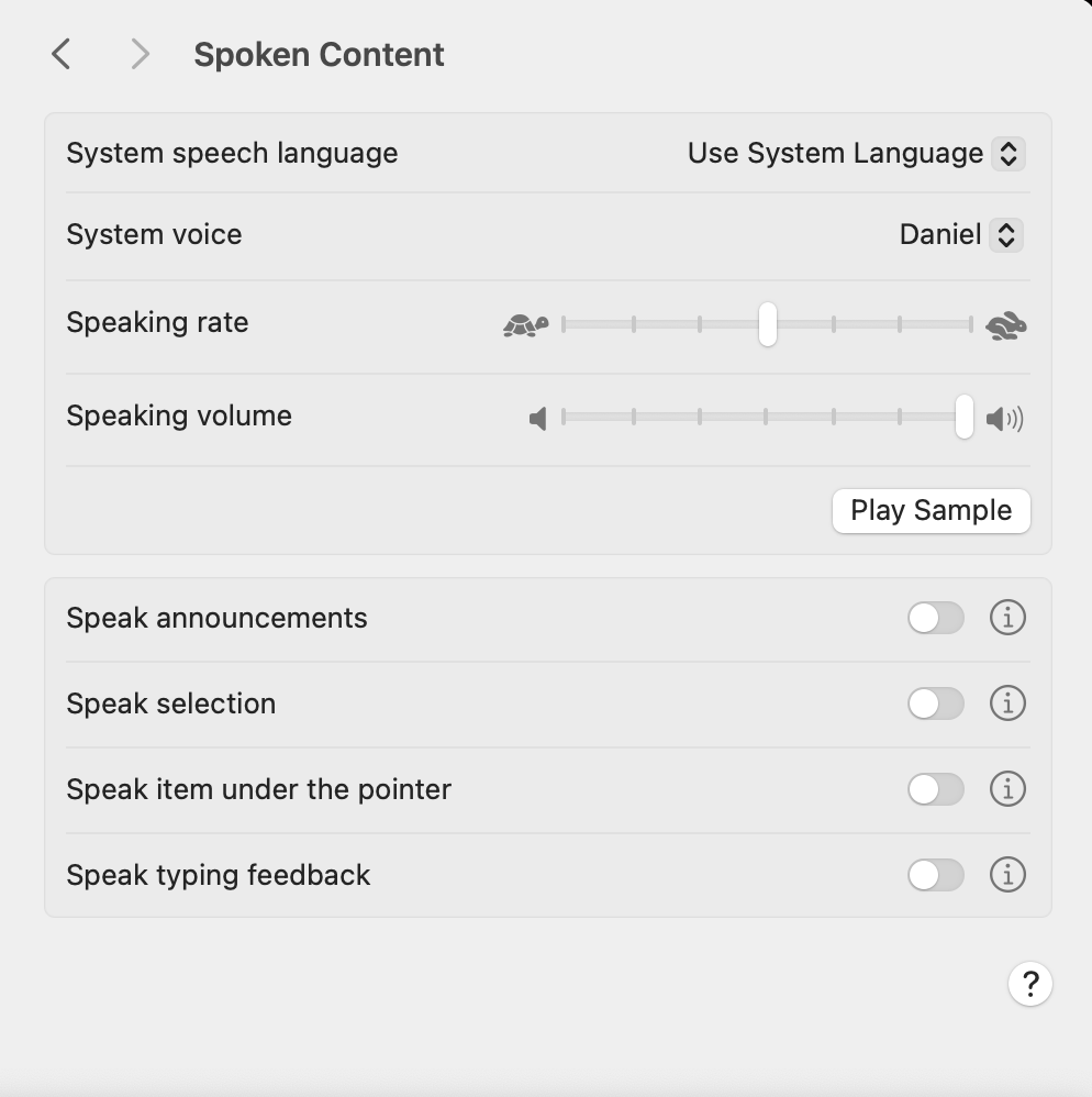
There are two tables: the top one covers general options, while the bottom one covers specific needs. The top row lets you select the System speech language, defaulting to “Use System Language” (there are a total of 33 other language options!). Just below that, you can choose the specific System voice:
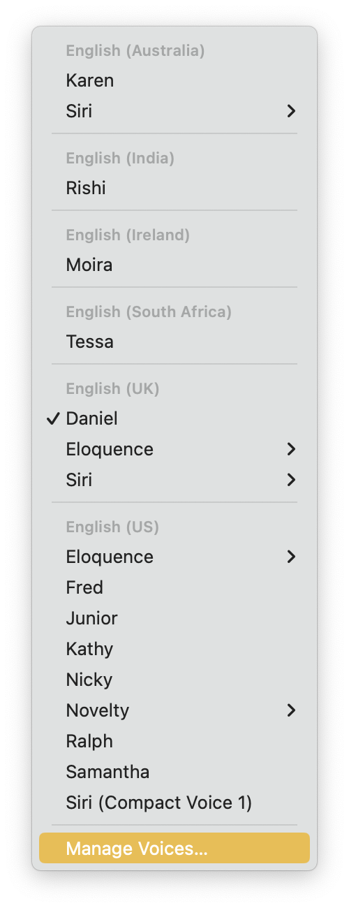
The choice is variegated and by tapping on Manage Voices… one can download, try, configure, and remove additional voices.
The two following sliders provide control over the Speaking rate and the Speaking volume. The Play Sample button reproduces the presentation phrase of the currently selected voice.
The second table has four options, all OFF by default, each with a toggle switch and an Info button. Pressing the ⓘ (Info) button opens a modal dialogue. Even after reading the macOS manual, I am not sure of what the Speak announcements does.
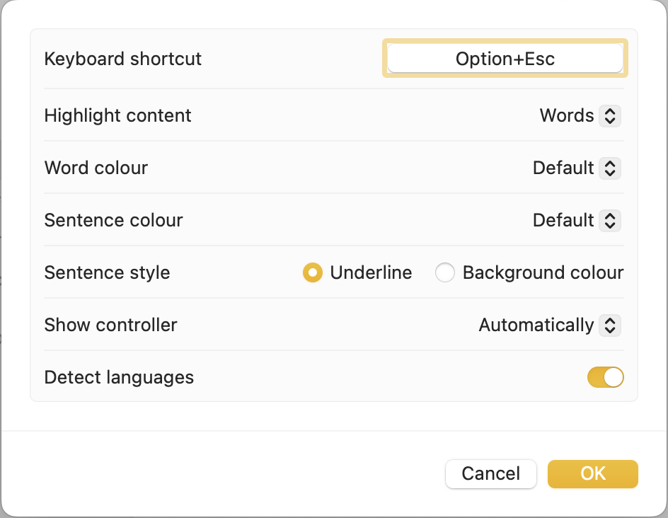
Speak selection is, instead, more straightforward: activate it, select some text, and press the default shortcut Option-Esc to hear the Mac speak the selected text. Pressing the Info button gives more grained control, which I will let you explore autonomously:
Speak item under the pointer is an incredible help for visually impaired users, but it risks becoming very annoying for everybody else. I suggest activating it to try it out, and then turning it off. In the Info dialogue, one could increase the After delay slider to avoid it being triggered while one moves the pointer around.
Speak typing feedback follows you while you are typing. The dialogue contains options for what the Mac should speak after, and it defaults to Echo characters, which I find a bit exaggerated. I recommend changing it to Echo words if you want to use it.
Descriptions
This page has a single option with a toggle switch: Play audio descriptions when available. The subtitle reads as follows:
Audio descriptions provide a spoken description of visual content in media.
This defaults to OFF.
Bottom Line
There you have it for the Vision section. I hope you enjoyed it and that you are already yearning for the next episode on the Hearing section. Thank you for reading so far!
If you are interested in music notation and editorial design, please consider joining my mailing list here, or browse my website to see what I do in general. I would deeply appreciate it.
I hope you found it useful. If you did, please leave a like, share it, subscribe to be notified of upcoming articles! Please share your experience setting up your Mac down in the comments, and have a great day!

One thought on “My upgrading path to Apple Silicon — Part 14”