A review of Dorico 6’s improvements to Notation and Engraving features
This article constitutes the second part of our expanded, paraphrased and enriched transcription of the excellent video by Anthony Hughes. Go watch it, then come back for a recap, or follow along while watching.
PART 2
Musical markings improvements
Showing a double barline at the start of the system
Something that was requested by several users—even if I have personally never seen it in practice—was the possibility to show a double barline at the start of a system when the previous system ended with a double barline. This option has now been added to Dorico 6 and, to activate it, you need to go to Notation Options ▶︎ Barlines, scroll down to the very bottom and select the option to the right:
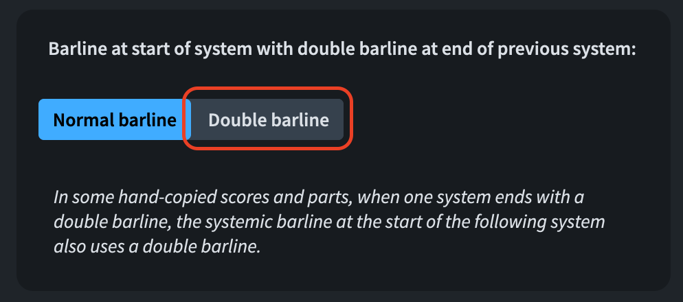
The fact that this option is placed among notation options means that it is flow-specific, giving you great flexibility.
Centre align bar numbers at start of system
The “Bar numbers” paragraph style is left-aligned by default. Some publishers, though, would like to have the first bar number of each system centre-aligned on the systemic barline. This wasn’t possible until now but, thanks to the new setting in Layout Options ▶︎ Bar numbers, this is no longer an issue.

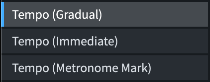
Tempo markings
Up to v5 included, tempo markings were drawn using Font Styles. This had two main drawbacks: you couldn’t have different sizes between score and part layouts, and you couldn’t (easily) hack your way around issues (e.g., long tempo texts overshooting the page margins in certain situations). Now, in version 6.x, tempo markings are drawn using Paragraph Styles. The great advantage to this is, as mentioned, the possibility of setting different font sizes for score and parts, especially in large scores where the staff size may be quite small.
There are three new styles: Tempo (Gradual), Tempo (Immediate), and Tempo (Metronome Mark), all found in Library ▶︎ Paragraph Styles.
Please note that the Tempo (Metronome Mark) style refers to the non-music part of the mark. So, if you have quarter-note equal 60, this style governs everything except for the quarter-note. For this, there is a new Character Style called Metronome Mark Music Text which, since this version, should be set up to a scale higher than ‘1’ (in my case 1 5/8, but I’ve also seen 1 3/5, it really depends on the music font used) to draw properly. You may encounter a few temporary issues with older documents, but new projects should behave properly.
Another improvement is the addition of an option to draw relative tempo changes—such as “meno mosso”—in the same style as gradual tempo changes. This is accomplished by going to Engraving Options ▶︎ Tempo ▶︎ Gradual Changes ▶︎ Relative Changes and selecting the option that suits your needs best.

Playing Techniques
On the Playing Techniques side, it is now possible to set a property on selected instances to show them parenthesised.
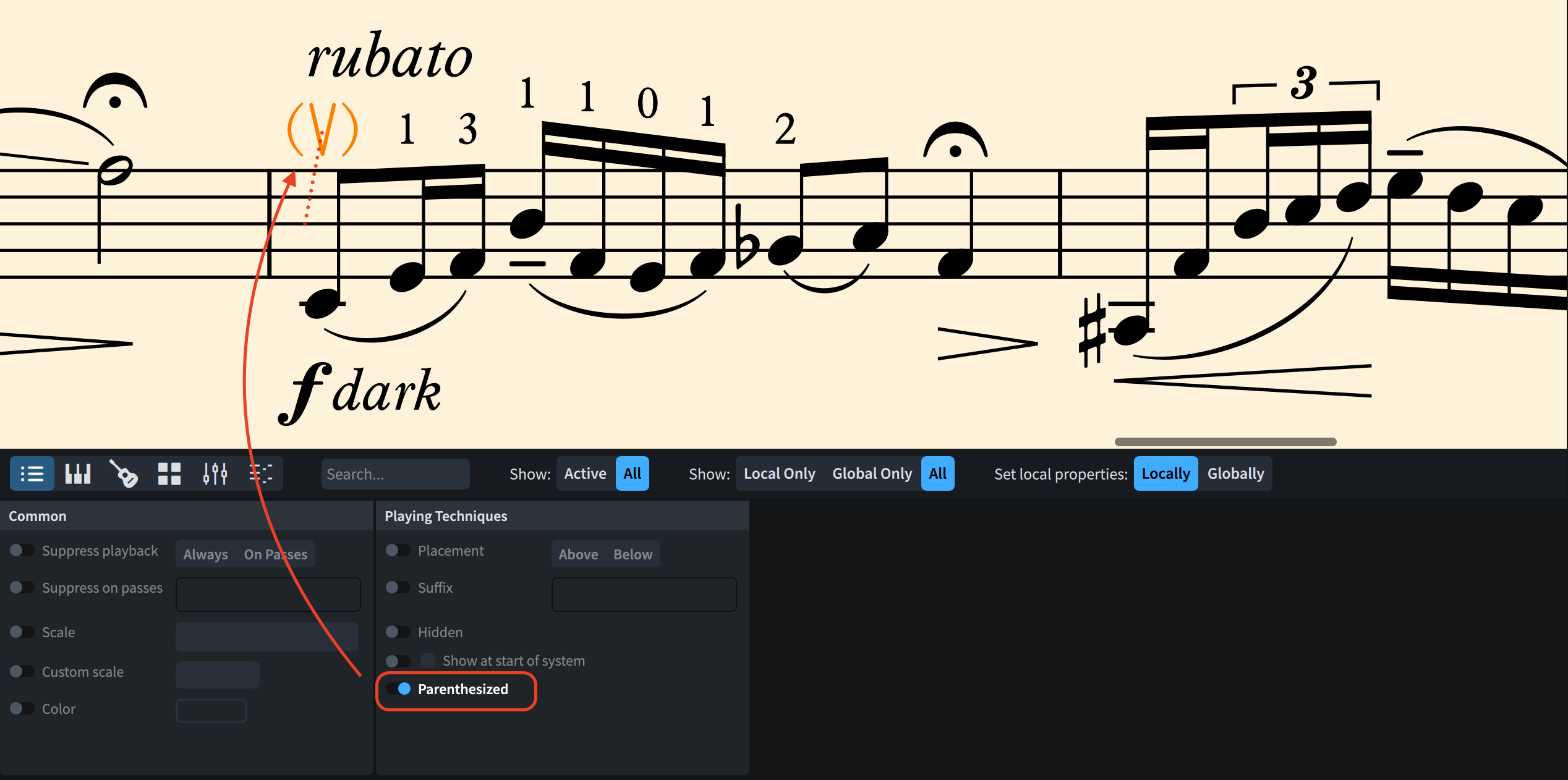
This is also possible via the popover by wrapping the popover text inside parentheses. In previous versions, this used to create a hidden playing technique directly. To achieve that now, use square brackets—this makes me lose my balance because I make an extremely heavy usage of editorial playing techniques which are all enclosed in square brackets. As soon as v6 was released, I had to rewire all my popovers to stop using square brackets.
In string writing, natural harmonic circles on tied notes need to be shown on all noteheads in a tie chain. It is a technical requirement because without a circle, the player might be encouraged to press down on the string, producing the same pitch but with a different timbre. A new engraving option allows now this to be the norm. You can find it in the new Harmonics section:
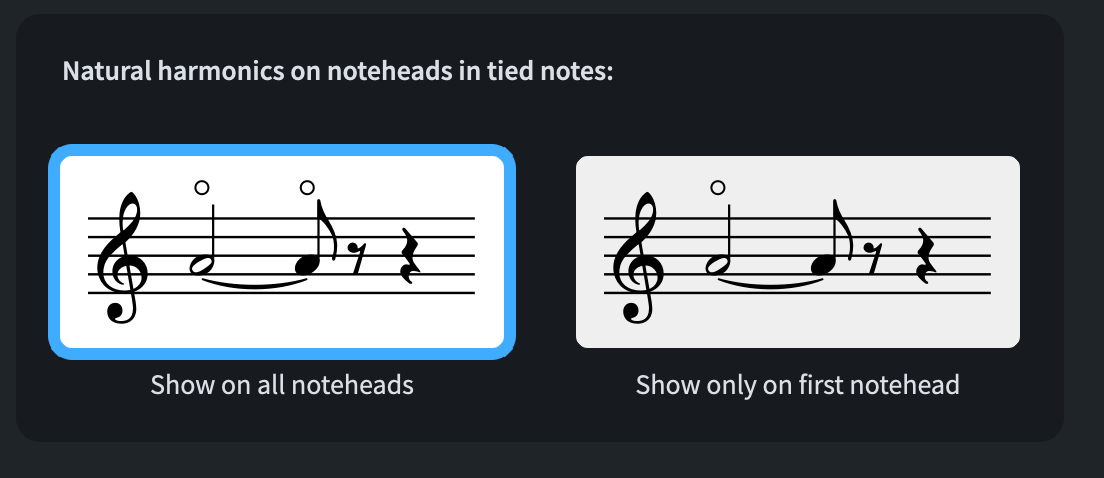
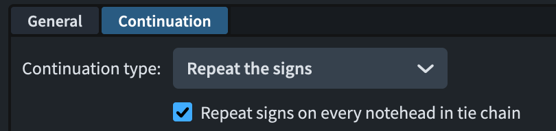
This improvement can now be applied to all glyph-based playing techniques. In the Edit Playing Techniques dialog, open the Continuation page and, when setting the continuation type to Repeat the signs, you will now be offered the choice of including notes in tie chains.
Tapered curve lines
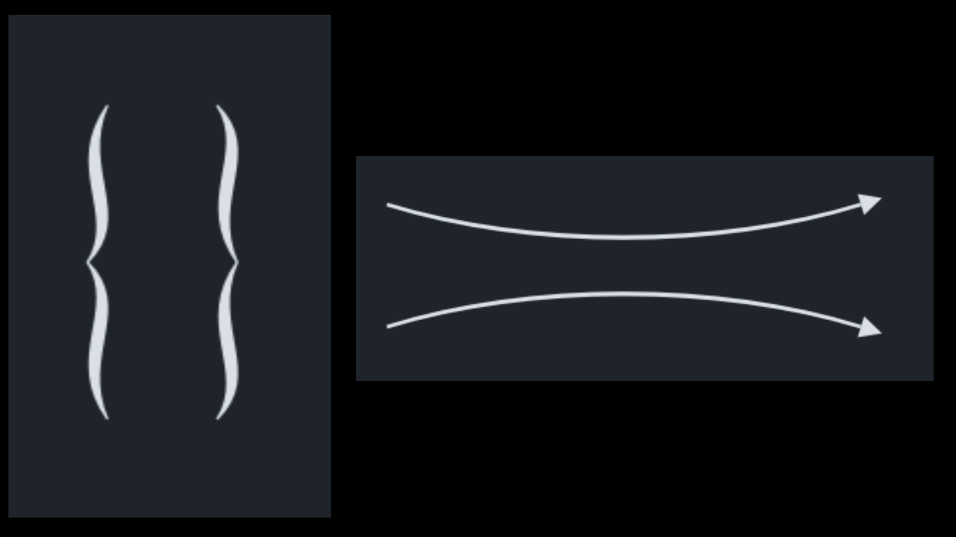
After a well-deserved drumroll introducing them, we can now finally create tapered curve lines. A few presets are already available, like horizontal curved lines with arrowhead ends, great for teaching material, or vertical braces (!), useful for grouping lyrics line at the moment of refrain.
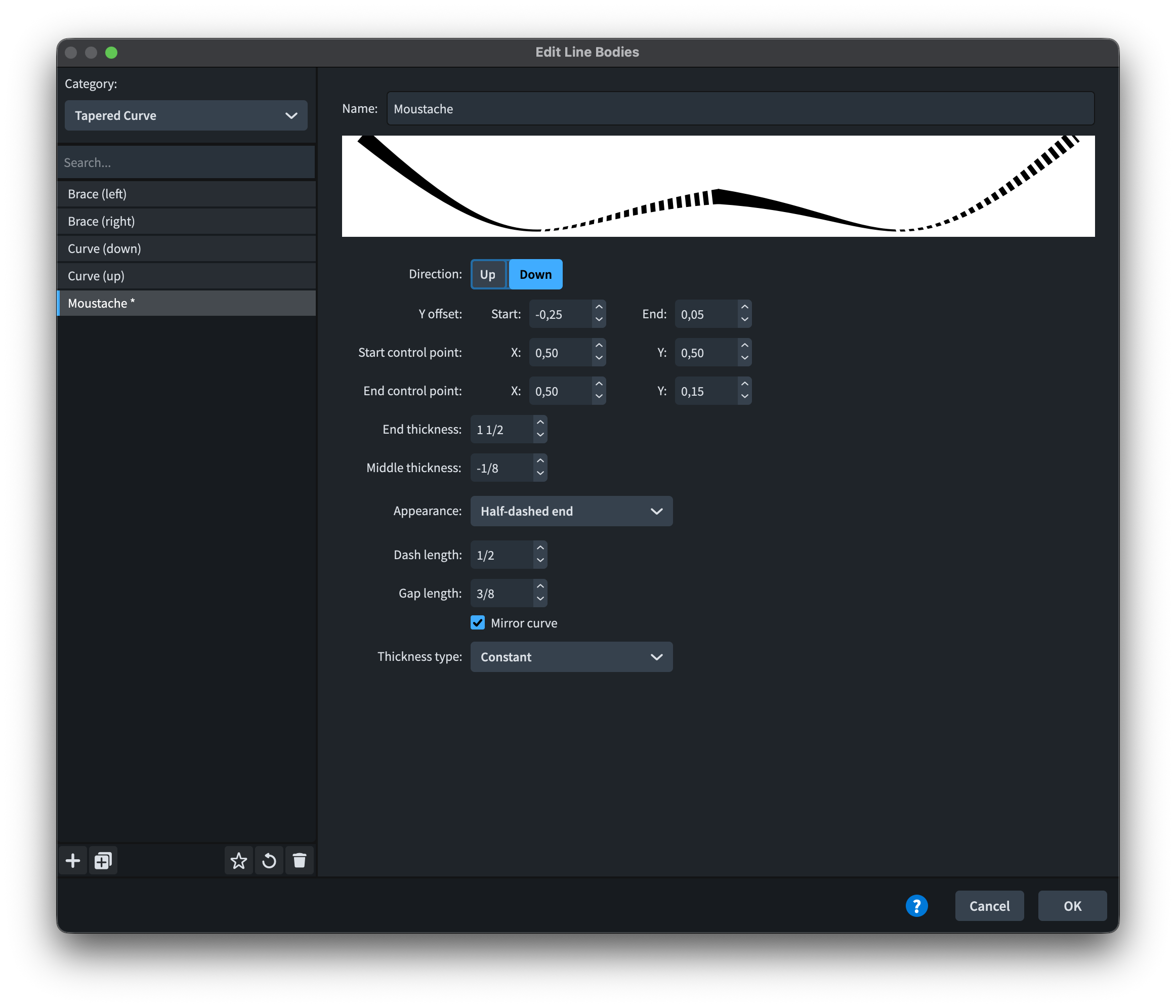
The full power of this new feature, though, comes online with the Edit Line Bodies dialog, accessible when you create a new line (or modify an existing one). In the Edit Lines dialog, which you can open by clicking on the + button at the bottom of the lines’ gallery, create a new line with the + button at the bottom left of the window. Expand the dropdown menu next to “Body style:” to reveal the available styles. Four are available to get started: curve (down) and curve (up), brace (left), and brace (right). There are a couple of issues: in the horizontal line menu, the braces display as up and down in the preview; in the vertical line menu, the preview is off-screen and does not display because of the default width of the window. You can drag to enlarge it, though, so no real harm done. Now, click on Line Body Editor to open the Edit Line Bodies dialog. From the “Categories:” menu in the top left, choose Tapered Curve.

In here, you can edit any setting of the existing presets, from the precise positioning of the endpoints to the thickness of the various elements, from the appearance to the thickness.
- The Y Offset governs the vertical position of the start and end extremities of the line
- The Start control point and End control point, each with an X and Y coordinate, determine the placement of the handle which is drawing the hump between the middle of the line and each end. This is a sort of percentage because ‘0’ corresponds to the beginning of the line, while ‘1’ corresponds to its end, with ‘0.05’ increments in between.
- End thickness, expressed in spaces, I guess, is how thick each endpoint is. In this case, it appears that one cannot have different thickness between the two endpoints.
- Middle thickness determines how thick the thickest point of the tapered curve is.
- The Appearance dropdown menu lets you choose between Solid, Dashed, Dotted, Half-dashed start, and Half-dashed end.
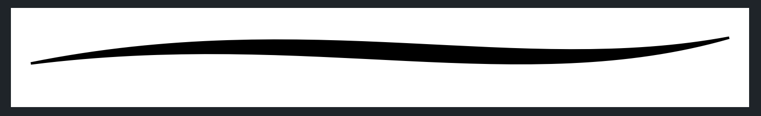
- The Mirror curve is the miracle that is making this kind of lines possible. Look at how the brace would appear if we unchecked that option:
- The Thickness type dropdown offers a choice between Constant, Proportional, Threshold, Exponential. According to our choice, the value beneath changes to nothing at all (Constant), Clamp (Proportional), Threshold (Threshold), and Damping factor (Exponential). The Clamp is a sort of threshold: the curve never gets thinner than the minimum value, and it does get thicker beyond the maximum value but at a much reduced rate (still, it is not clear what measurement unit they are using here). I believe that these values are there to determine what happens when a brace becomes longer or taller. It looks bad if one just scales a brace proportionally in all directions—it would be too thick—so these values are in there for this reason.
Creating a new body type is also super fun, as shown here:
Text improvements
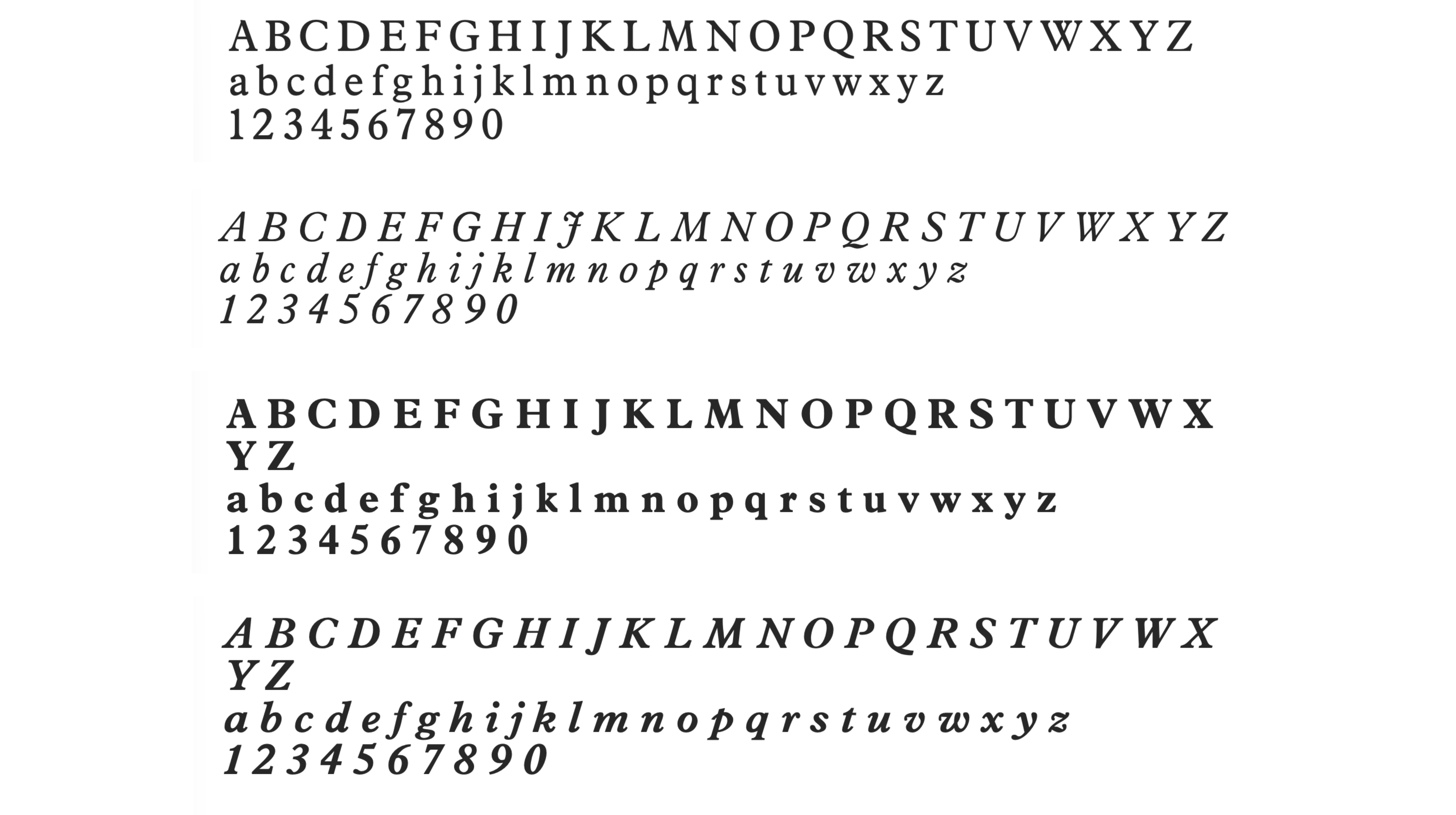
Text management received a lot of love in Dorico 6. A new text font family comes now installed with Dorico, and it’s called Splentino, a new digital recreation of Monotype’s (legendary) Plantin typeface, by Ben Byram-Wygfield. This is narrower than the Plantin Pro Std version still available from Monotype itself, either directly or through the Adobe CC subscription. I have to say that I just love this new typeface and that I have been successfully using it for several assignments over the past months.
New in Dorico 6, Paragraph Styles, Font Styles, and Character Styles now support OpenType features offered by the chosen fonts. This allows you to activate specific features just for a single paragraph style, such as having small caps for the Title paragraph style:

The world of OpenType features is just massive and beyond the scope of this specific article. I encourage all of you to go out and learn more about it, as it is simply fascinating.
While in the paragraph style dialog, there are new controls added in Dorico 6 that deserve our attention. We can now specify the following for each paragraph style and, therefore, for each text object created with it:
- whether it should appear above or below the staff
- at what vertical distance from the staff it should appear
- what horizontal offset from the rhythmic position it is attached to

This, in conjunction with the existing feature of being able to set key commands for specific paragraph styles, makes the creation of custom text markings a breeze.
Lyrics
To close this rich review, we have some improvements to lyrics. Through the Shift-Option/Alt-◀︎/▶︎ standard key command for shortening and lengthening items, it is now possible to edit the duration of a single lyric. This is particularly useful for when a group of lyrics belonging to different voices needs to have matching duration lines, something that Dorico would not do automatically.
While in Write mode, the Option/Alt-◀︎/▶︎ command now moves lyric syllables from note to note, instead of following the rhythmic grid. Dragging with the pointer is now also possible.
Dulcis in fundo, MIDI import and export now also include lyrics!
Bottom Line
And that’s all, folks! This was a massive walkthrough and I hope you enjoyed it. We have a few more episodes before we can consider our initial coverage of Dorico 6 complete. But fear not, we are not done yet!
If you enjoyed this post, please leave it a like, subscribe to get notified of upcoming articles, and don’t forget to do the same for Anthony’s video and for the Dorico YouTube channel.
Should you be interested in my other activities, please visit my website and consider joining my mailing list, where you will be able to follow my journey through music notation and independent music publishing.
Thank you for your time, and see you here in the next episode.

2 thoughts on “It’s the small things!”