100 Days of SwiftUI – Day 32
Learning Swift Day 217
Create a new Single View application, name it “Animations” and save it somewhere sensible. During this process I learned that even if my master folder for the 100 Days of SwiftUI is already under source control, I could put my project under source control to have a more fine-grained control over it.
For example, when I will be doing the challenges, I thought I could have switched to the “challenges” branch but then I realised that in such a branch there is not going to be this project … so, what am I going to do? For this project again I am going to create yet another branch, but starting from the next project, I will put the single project under source control and move on from there until the project is over. In the end the method I was using for the first 100 Days of Swift looked better …
I tried to create a new Git repository but Xcode told me the project is already under source control so I am not allowed to do that… very strange all this is!
Creating implicit animations
To be able to use the same project for all this lesson we are going to create a new Group in our Project Navigator calling it “Views”. Inside we are going to create a new SwiftUI view file called “ImplicitAnimation” and work on from there.
Inside the body property create a Button with a string “Tap Me” inside the first set of parentheses, then open the braces to invoke the action closure and write a comment which says “do nothing”. Then, after the closing brace, add four modifiers: a .padding(50) (padding of 50 points), a red background color, a white foreground color and a circle clip shape.
Before the body property create an @State private variable property called “animationAmount” with a type annotation of CGFloat and a value of 1. Then add a modifier on the button using the initialiser .scaleEffect(s: CGFloat) passing our property as argument.
Now add self.animationAmount += 1 as the buttons action. To run this code go to ContentView.swift and, instead of the Text view place an instance of ImplicitAnimations(). To make the transition smooth, add another modifier to the button in the form of .animation(), passing it .default as argument. We can also add other modifiers and the animation will apply to them. For example, add a .blur(radius: (animationAmount - 1) * 3) modifier (before or after .animation is the same, which makes me raise an eyebrow) and see how it looks.
All this is very nice but all this list of “dot-something” is really ugly to my eyes. I do not like it. Also, their default indentation is leading-aligned with the name of the kind of View we are using, which makes bigger chunks of code very hard to read. I am no Core Animation expert so I cannot say if this is better or not than before, I am just saying that I find it harder to understand and grasp.
Customising animations in SwiftUI
We can pass different arguments to the .animation() modifier. For example: .easeOut will cause the animation to just slow down at the end, while .default was a combination of easeIn + easeOut.
Another option makes the button scale up quickly and then bounce. This is called .interpolatingString and as the Documentation is empty!, I will let you judge from this image:
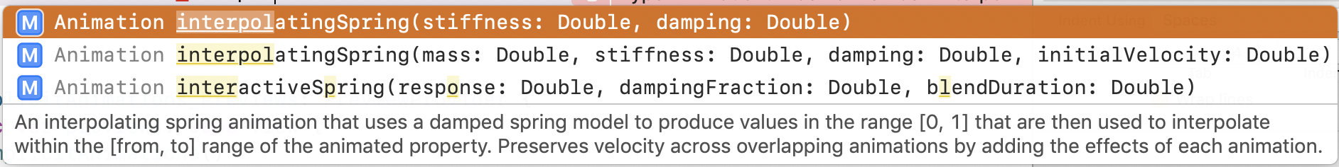
First… where is the animated property? I mean, where is the range of the animated property? What does all this mean? Where can we see what this means? Where is a manual for this written by Apple?!
Anyway … pass 50 as first argument and 1 as second. Why? No idea… from the description it seems one should choose between 0 and 1 but it is not so.
To any one of these options we can still pass a (duration:) parameter which will ask for how many seconds we want the animation to last.
As all these animations come from the Animation struct, let’s delve into the definitions. This is a spring animation:
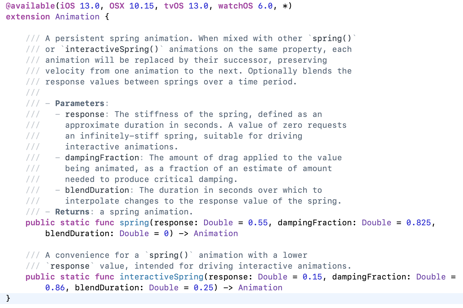
A bit below we see an extension of all those properties we saw before (easeIn, for example). For each one of them there is a method and a property. So, the animated property I was yelling at few lines ago could possibly mean one of those. So, if we call them as methods we cannot then attach further things to them, but if we call them as properties we absolutely can!
Now we get to that interpolating spring of before and, as expected, no matter what people can tell me, if one has an engineering degree or, at least, some high school (and fresh!) level of physics knowledge, all this should make sense, otherwise, no way! Especially if it is in another language (native Italian here!).
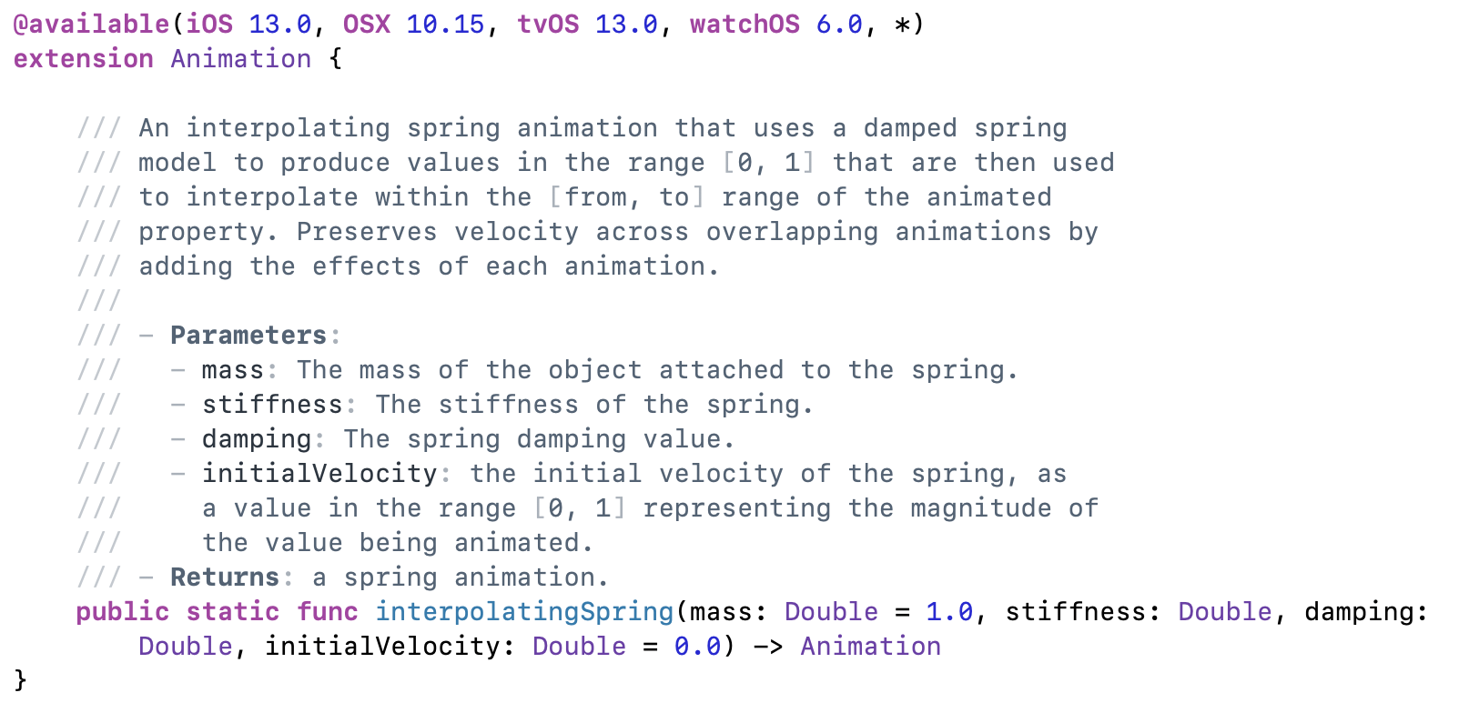
This is also quite interesting and, finally, we get something properly explained:
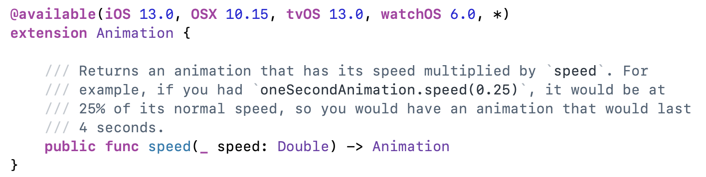
Fresh from our eureka moment, we can now write code like this:
animation(Animation.easeIn(duration: 2).delay(1))
…which Paul writes like this:
.animation(
	Animation.easeIn(duration: 2)
		.delay(1)
)
Clearer? Maybe… to me its just line noise… I want to have everything together!
By writing code like this:
.animation(Animation.easeInOut(duration: 1).repeatCount(3, autoreverses: true))
…we get an animation that, over one second, bounces up and down before reaching its final size. The autoreverse is interesting because, if true, it makes the view go back and that going back counts against the, for example, 3 we had above. If we set it to false, we then get the view scale up, immediately become little again, then scale up, for a total of three times. So, if we want the “same effect” with autoreverse, we need to double the number passed as argument.
By passing .repeatForever(autoreverse:) instead of the last modifier, we can get an animation that continues forever. Combining it with .onAppear() will make the animation last for the life of the view. To realise that, remove the animation, the scale effect and the change to animationAmount from inside the Button action. Next, add an overlay in the form of a circle with a red color, a scale effect equal to the animation amount and an opacity equal to the Double version of 2 - animationAmount. After this, add back the animation we had before, with an ease-out duration of 1 and a repeat forever action with false autoreversing. Finally, add an .onAppear block calling self.animationAmount = 2.
The result is really nice even if I am not sure I understand every bit of it.
Animating bindings
Reproduce a starting-point in code like this one:
struct AnimatingBinding: View {
    @State private var animationAmount: CGFloat = 1

    var body: some View {
        VStack {
            Stepper("Scale amount", value: $animationAmount.animation(), in: 1...10)

            Spacer()

            Button("Tap Me") {
                self.animationAmount += 1
            }.padding()
                .background(Color.red)
                    .foregroundColor(.white)
                        .clipShape(Circle())
                            .scaleEffect(animationAmount)
        }
    }
}
Now go into ContentView and change the instance being run to AnimatingBinding() inside of the body property. At its beginning, now, add a print() statement for the animation amount and add the return keyword before VStack.
We can even try this:
Stepper("Scale amount", value: $animationAmount.animation(
    Animation.easeOut(duration: 1)
        .repeatCount(3, autoreverses: true)
    ), in: 1...10)
This kind of things have incredible potential but again I want to stress out how we need to strive towards writing things more clearly, with indentation that let us understand which code belongs where.
Creating explicit animations
Another way to create animations is to explicitly ask SwiftUI to animate the changes that are a consequence of a state change. I am really struggling to understand this concept of “state”… I wish there would be a real-world example for dummies to explain this.
To do so we need to be explicit in saying when the animation should happen, in reaction to an “arbitrary” state change. The translation of arbitrary in Italian has about 20 meanings so I am not really sure what I should take away from this. Anyway, the animation will not be attached to a binding, nor to a view, but to a particular state change. Clearer? No, but whatever, let’s see some code. Let’s start from here:
struct ExplicitAnimations: View {
    var body: some View {
        Button("Tap me") {
            // do nothing
        }.padding(50)
            .background(Color.red)
                .foregroundColor(.white)
                    .clipShape(Circle())
    }
}
To get some state to track add an @State private var animationAmount = 0.0, then add the rotation3DEffect() modifier to the button passing it the argument .degrees(animationAmount, axis: (x: 0, y: 1, z: 0)).
Next, add a withAnimation closure into the button’s action saying self.animationAmount += 360. We can also add some other modifier to the animation such as withAnimation(.interpolatingSpring(stiffness: 5, damping:1)).
Really impressive, but somehow murky and dark. I am starting to feel very scared about the upcoming challenges as even with all these informations I feel quite lost.
100 Days of SwiftUI – Day 33
Learning Swift Day 218
Controlling the animation stack
We start this lesson reviewing two important concepts: the order of modifiers matters and we can apply an animation() modifier to a view so that it implicitly animates changes. Let’s now start with this code:
struct ControlAnimationStack: View {
    var body: some View {
        Button("Tap Me") {
            // do nothing
        }.frame(width: 200, height: 200)
            .background(Color.blue)
                .foregroundColor(.white)
    }
}
Now create a private variable property wrapped into an @State property wrapper, call it enabled, set it to false and toggle its value inside the button’s action. At this point edit the .background modifier by inserting a ternary conditional based on the enabled property. Set it blue if it is enabled and red if it is not. Finally add the .animation(.default) as a modifier to the button. Run this code (remembering to call this new file inside the ContentView struct) to check everything works as intended.
The next revelation is that we can attach the animation() modifier several times and the order in which we do so matters! Add a new modifier to the Button in the form of a .clipShape() which will clip the button as a rounded rectangle with a corner radius of 60 points if the enabled property is true or of 0 (that is, an ordinary rectangle) if false. This will cause no animation for this last modifier. Now exchange place of the last two modifiers and see how also this change gets animated. This teaches us that only changes that occur before the animation modifier get animated.
It is very easy now to let this new power take control of us, applying multiple animation modifiers, so that every one controls what was before it. To test this, insert a default animation modifier after the background color modifier and add an extra animation modifier at the end in the form of an interpolating string with a stiffness of 10 and a damping of 1.
It is also possible to have some part of our modifiers be animated while others do not. Simply pass nil as the animation’s argument. Thing of it as a dam!
Animating gestures
Let’s start from this code, again inside a new SwiftUI View file.
struct AnimatingGestures: View {
    var body: some View {
        LinearGradient(gradient: Gradient(colors: [.yellow, .red]), startPoint: .topLeading, endPoint: .bottomTrailing)
            .frame(width: 300, height: 200)
            .clipShape(RoundedRectangle(cornerRadius: 10))
    }
}
Now create an @State private property called dragAmount initialised to CGSize.zero. This will store the amount of the drag around the screen. Hopefully I will soon understand why this needs to be a CGSize. Now add a .offset() modifier passing dragAmount as argument.
At this point we need to add the .gesture() modifier which wants a Gesture parameter. A Gesture in SwiftUI is a public protocol defined as
An input gesture, a value that matches a sequence of events and returns a stream of values.
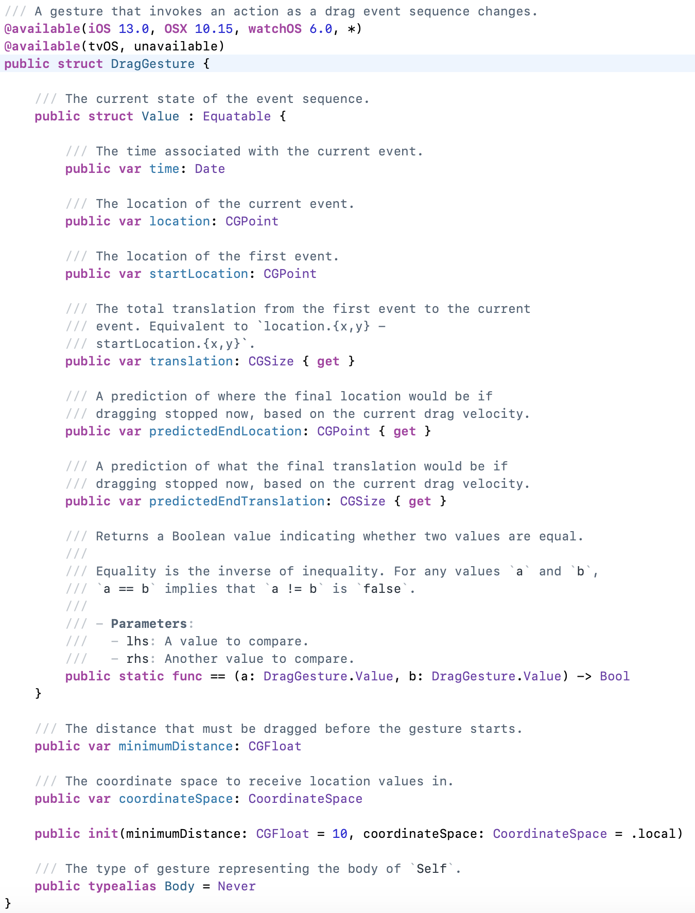
That parameter will be an instance of DragGesture(), so defined in the library:
On this instance we are going to call two methods (modifiers?), .onChanged and .onEnded, both self-explanatory in what they do but the how needs something more. Paul simply writes this:
.gesture(
	DragGesture()
		.onChanged { self.dragAmount = $0.translation }
		.onEnded { _ in self.dragAmount = .zero }
)
This is perfectly fine and clear for someone already used to this level of abstraction, but for me, I preferred to write it in a slightly longer way in order to understand how these two closures worked, as they both accept a parameter to describe the drag operation and, in the first closure above, this doesn’t appear. This is my version, again, functionally the same as Paul’s one:
.gesture(
	DragGesture()
		.onChanged({ value in
        	self.dragAmount = value.translation
        })
		.onEnded({ _ in
			self.dragAmount = .zero
		})
	)
Sure, more lines, but the intent is clearer (at least to me!)
To see an implicit animation in action simply add the .animation(.spring()) modifier to the linear gradient. To get an explicit animation instead remove that line and, in the .onEnded closure, add the withAnimation(.spring()) closure around the previous one.
Showing and hiding views with transitions
Create a new SwiftUI View file called Transitions.swift. Let’s start with this simple code:
struct Transitions: View {
    var body: some View {
        VStack {
            Button("Tap Me") {
                // do nothing
            }

            Rectangle()
                .fill(Color.red)
                .frame(width: 200, height: 200)
        }
    }
}
Now create an @State private variable Boolean called isShowingRed to manipulate whether we want the rectangle to be shown or not. Wrap the Rectangle() and its modifiers in an if isShowingRed statement and toggle the Boolean inside the button’s action. Now wrap the toggle inside a withAnimation closure, which will make the red rectangle fade in and out, moving the button up to make space.
After building and running to see the effect please add the .transition(.scale) modifier to the rectangle. To experiment further, change the .scale part to .asymmetric(insertion: .scale, removal: .opacity)).
Building custom transitions using ViewModifier
Create a new Swift file called CornerRotateModifier, import SwiftUI and proceed as follows. Create a new struct called CornerRotateModifier which conforms to the ViewModifier protocol. Inside declare two constant properties, an amount of type Double and an anchor of type UnitPoint. Below that create a body method (which is the requirement of the ViewModifier protocol) which accepts a content parameter of type Content and returns some View. Inside the body of the method, set the clipped() modifier on the rotationEffect() modifier which is applied to the content parameter. In the rotation effect, pass the .degrees(amount) as first argument and anchor as second.
To achieve the best result create an extension to the AnyTransition struct which is defined as a type-erased Transition, creating a static variable property inside called pivot of type AnyTransition, which is a computed property returning a .modifier(active:identity:) instance. For each parameter pass an instance of our CornerRotateModifier(amount:anchor:) struct, respectively with -90 and 0 for the amount and .topLeading for the anchor.
Now we are ready to complete this by animating a view of ours with .transition(.pivot).
I can now go to sleep happy, waiting for tomorrow’s challenges!
Thank you for reading!
If you like what I’m doing here please consider liking this article and sharing it with some of your peers. If you are feeling like being really awesome, please consider making a small donation to support my studies and my writing (please appreciate that I am not using advertisement on my articles).
If you are interested in my music engraving and my publications don’t forget visit my Facebook page and the pages where I publish my scores (Gumroad, SheetMusicPlus e ScoreExchange).
You can also support me by buying Paul Hudson’s books from this Affiliate Link.
Anyways, thank you so much for reading!
Till the next one!
 Music Preparation Services